Basil Huwyler
Magazine


Print Magazine & EPub Version for Tablets
2018
2018
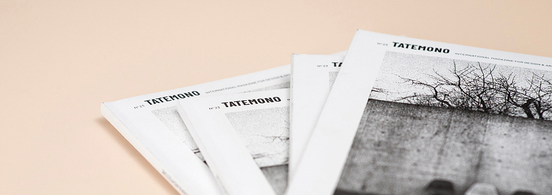
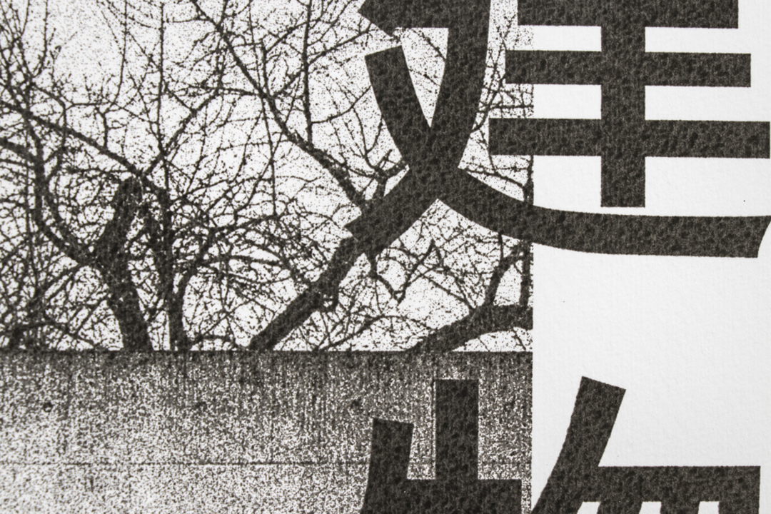
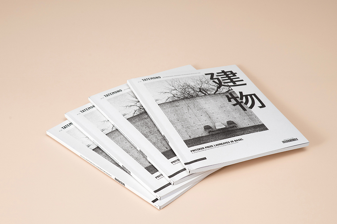
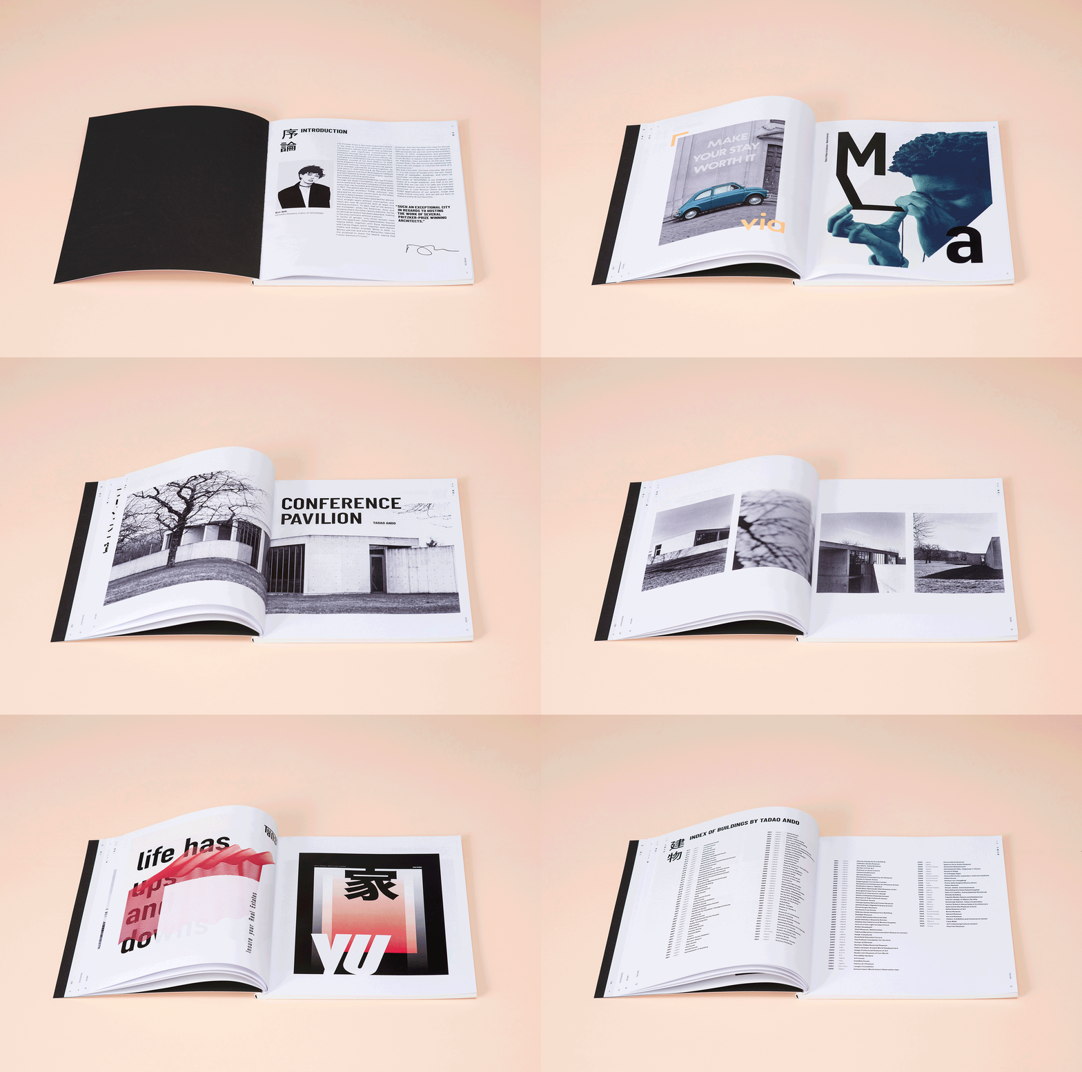
The fictional architecture-magazine “Tatemono” tries to merge not only two languages but also design in reference to the content.
In teamwork with Sashauna Wray, two products were developed: The printed Magazine and a digital epub version with interactive elements to view on a tablet.
All analogue photographs and notional advertisements were created by us, as well as the binding and the silk-screen printed cover.
In teamwork with Sashauna Wray, two products were developed: The printed Magazine and a digital epub version with interactive elements to view on a tablet.
All analogue photographs and notional advertisements were created by us, as well as the binding and the silk-screen printed cover.
Posters
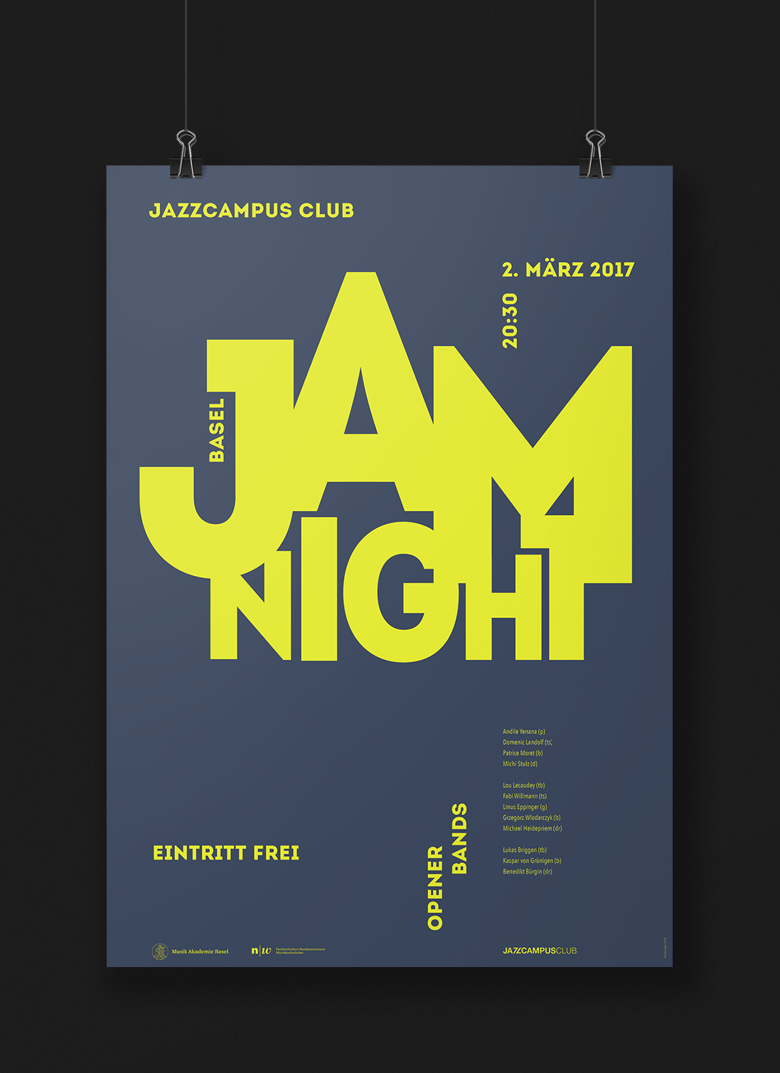
«Jam Night», 2016
The Jazz-School (jazzcampus) in Basel frequently organises jam sessions, that are open to the public. We had the opportunity to design draft-proposals for one of these events. The developed logo can be implemented as key visual into different kinds of advertising media.
The Jazz-School (jazzcampus) in Basel frequently organises jam sessions, that are open to the public. We had the opportunity to design draft-proposals for one of these events. The developed logo can be implemented as key visual into different kinds of advertising media.
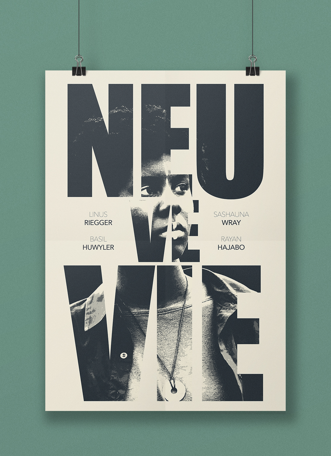
«Neuvevie», 2016
Movie poster for the short film «Neuvevie» that premiered in 2016.
Single-colour silk-screen print on newsprint.
Movie poster for the short film «Neuvevie» that premiered in 2016.
Single-colour silk-screen print on newsprint.
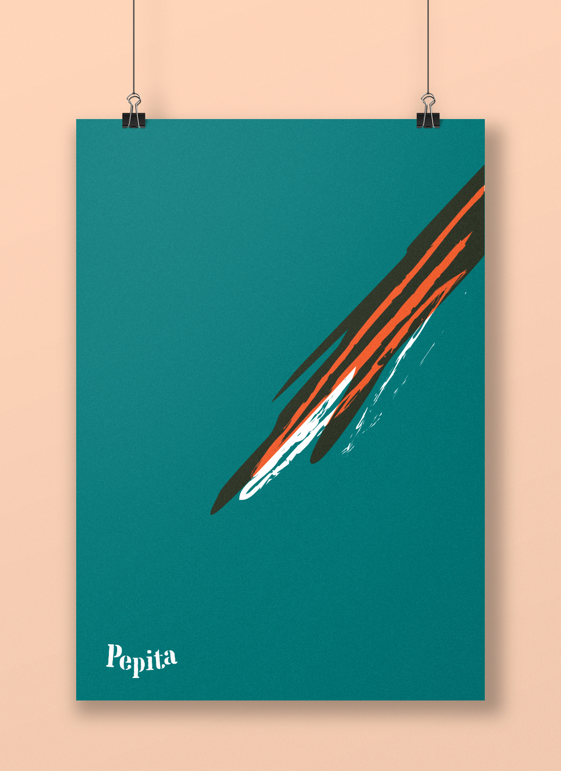
«Pepita», 2017
Poster design for the 100th anniversary of the Swiss graphic designer Herbert Leupin. With wit and flair, he designed, among various work, the unmistakable appearance of the beverage brand Pepita.
This design is intended as a tribute to the analog craft of the artist which has become rare in digital times. It teases with the parrot, of which only the tail feather can be seen and refers to the original designer, without whom the Pepita posters are simply not the same.
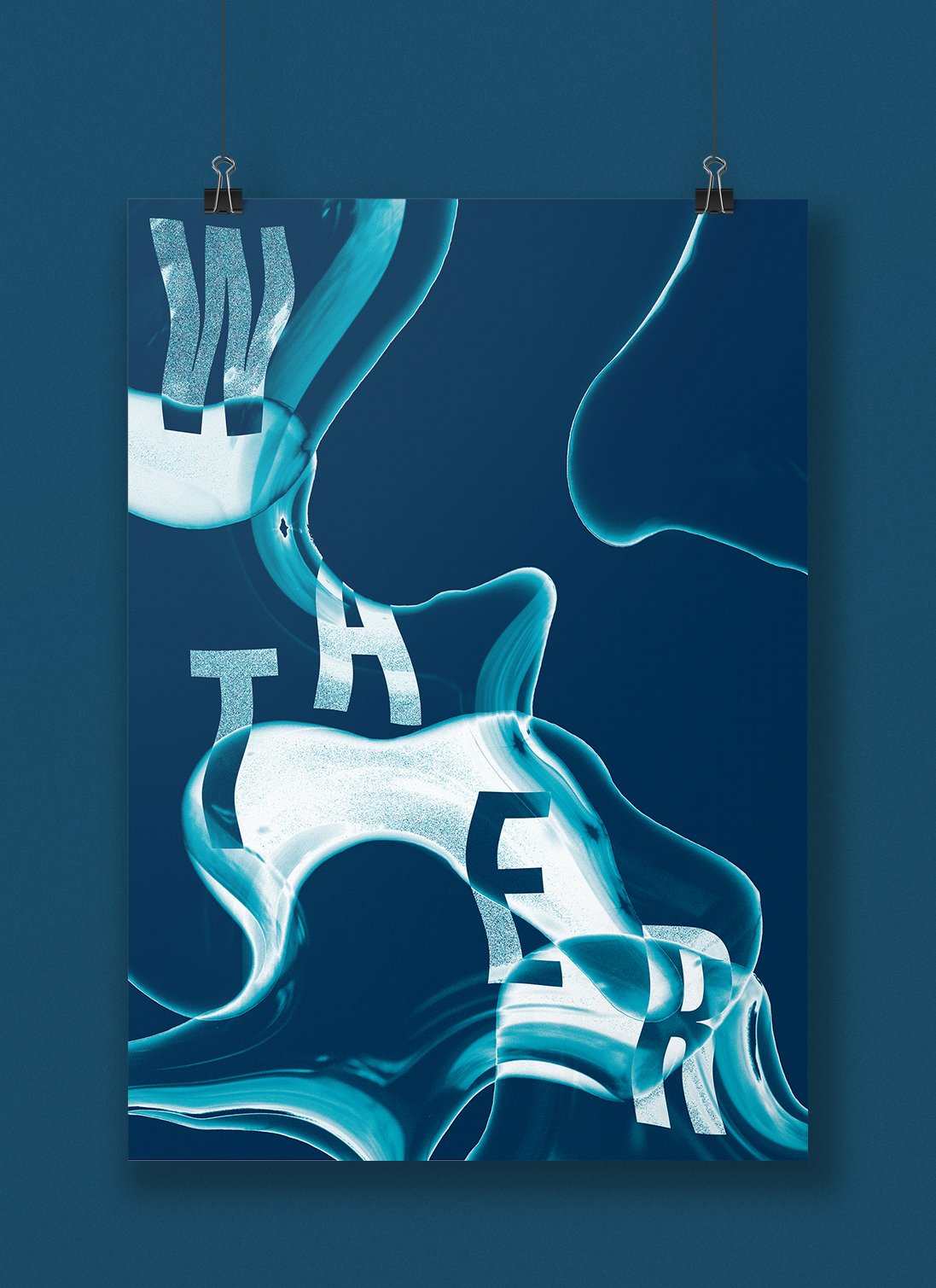
«Water», 2017
With the subject of «water» and an experimental approach this duotone poster was developed as a personal project. The image consists of a composition of micro-photographies of waterdrops.
The poster was offset printed with two full-tone colours.
With the subject of «water» and an experimental approach this duotone poster was developed as a personal project. The image consists of a composition of micro-photographies of waterdrops.
The poster was offset printed with two full-tone colours.

«Buch Basel», 2016
With this one-week teamwork project the aim was to create a key visual concept for the annually held literature festival «Buch Basel».
The immersive world of books was visualized through text projected onto the bodies of the readers.
With this one-week teamwork project the aim was to create a key visual concept for the annually held literature festival «Buch Basel».
The immersive world of books was visualized through text projected onto the bodies of the readers.
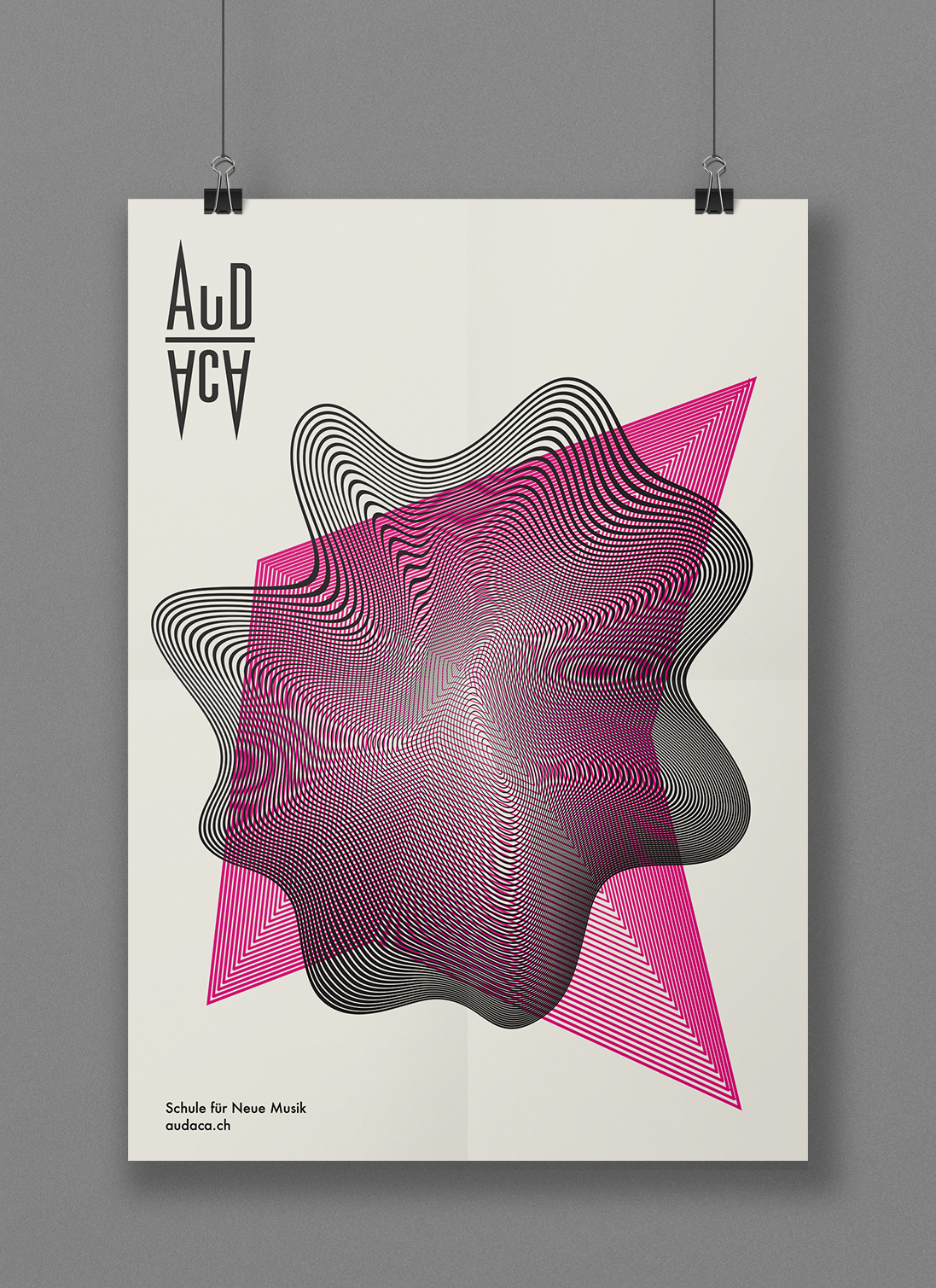
«Audaca», 2018
This poster ist one of several Corporate Design applications for the fictional School for New Music «Audaca» that I developed for my degree.
This poster ist one of several Corporate Design applications for the fictional School for New Music «Audaca» that I developed for my degree.
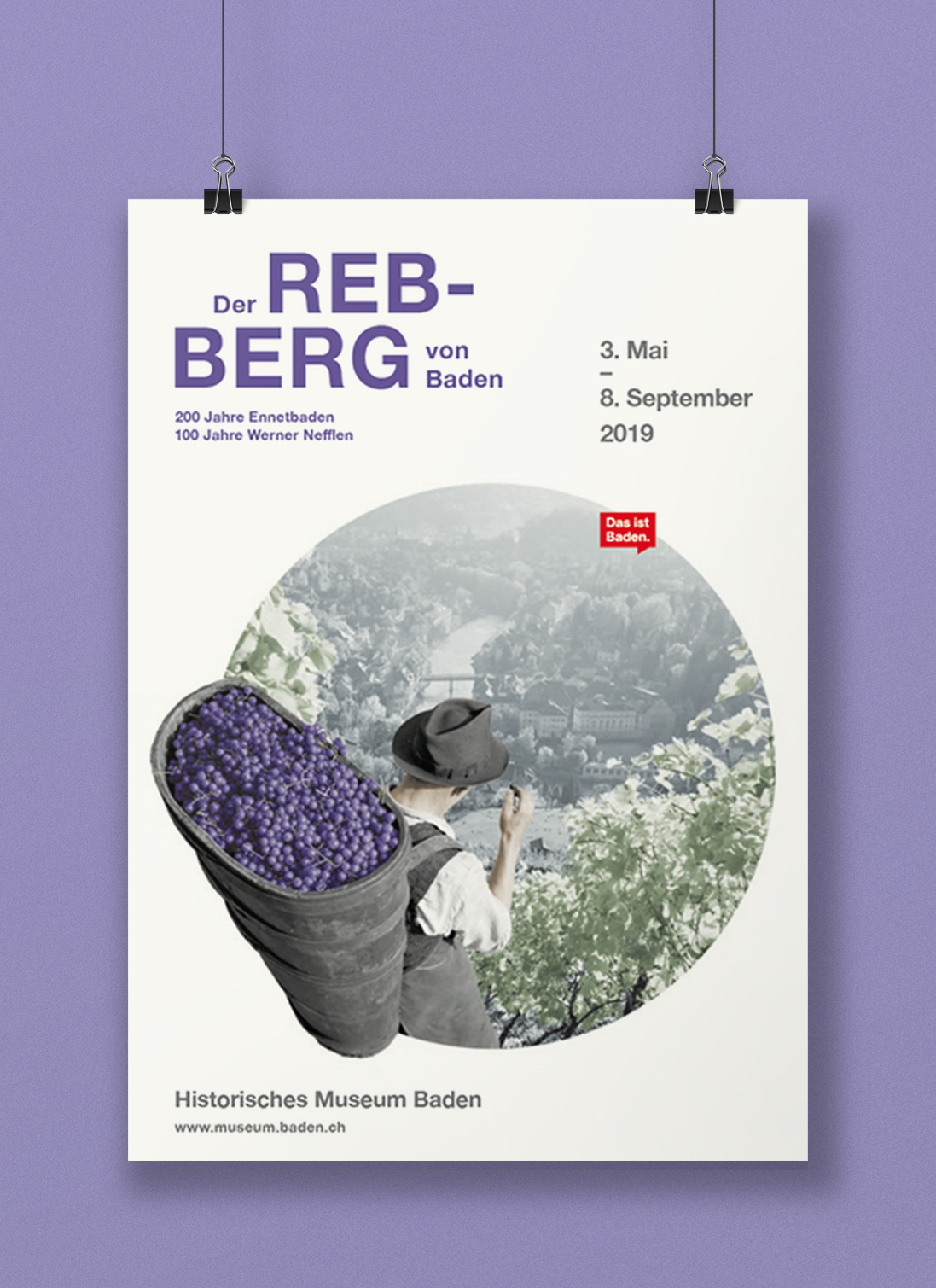
«Der Rebberg von Baden»,
2019
Poster for the special exhibition at the Baden Historical Museum on the occasion of the 200th anniversary of Ennetbaden.
Exhibition design realised by Stauffenegger + Partner, Basel
museum.baden.ch
Poster for the special exhibition at the Baden Historical Museum on the occasion of the 200th anniversary of Ennetbaden.
Exhibition design realised by Stauffenegger + Partner, Basel
museum.baden.ch
Corporate Design
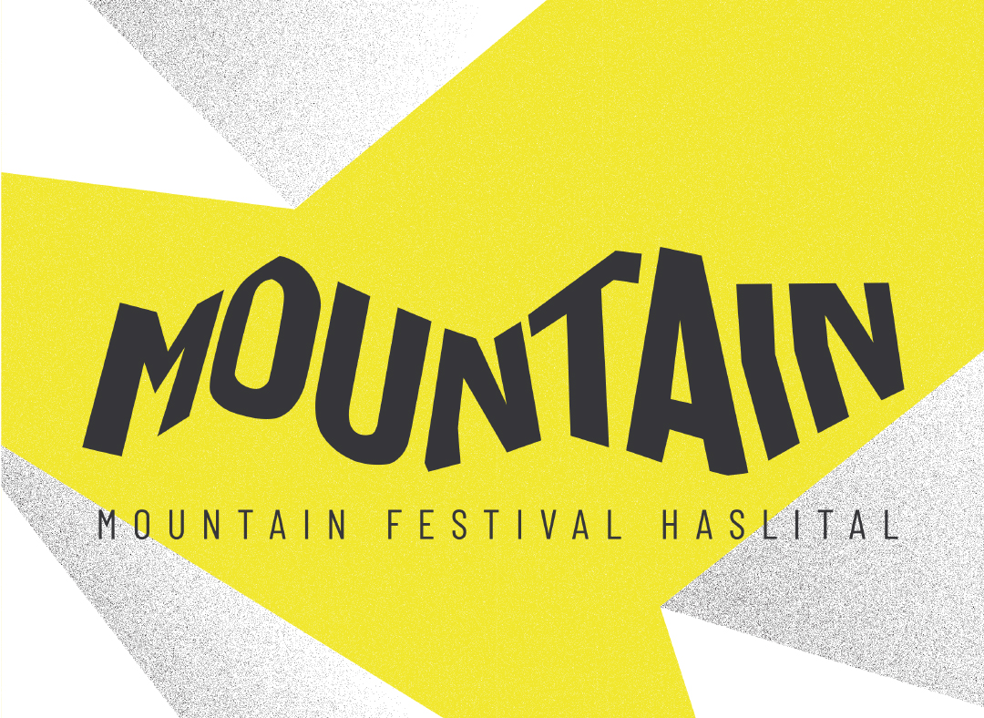
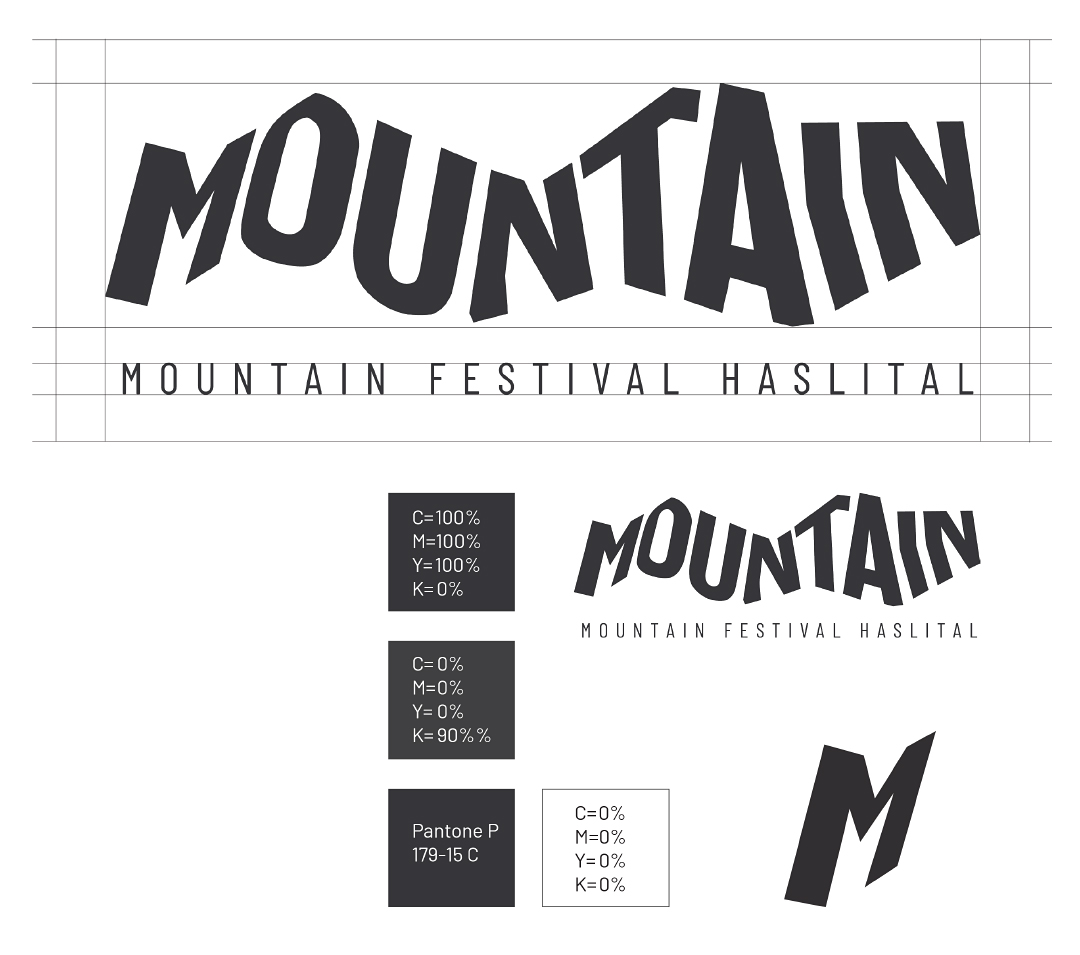
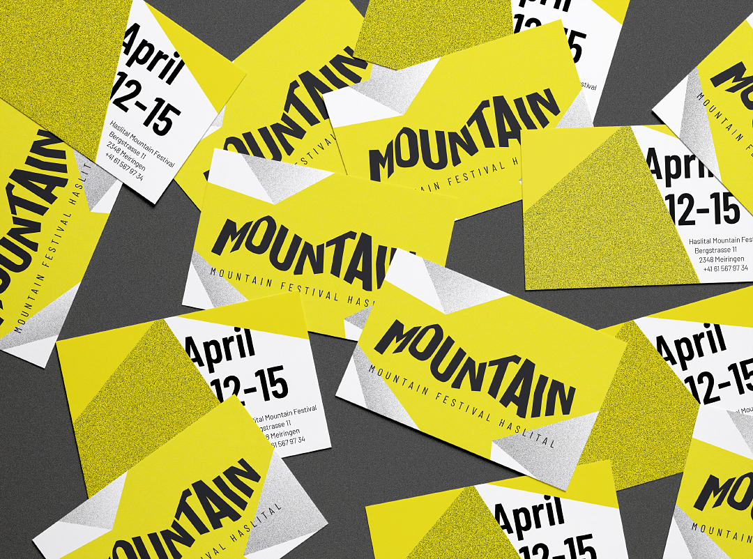
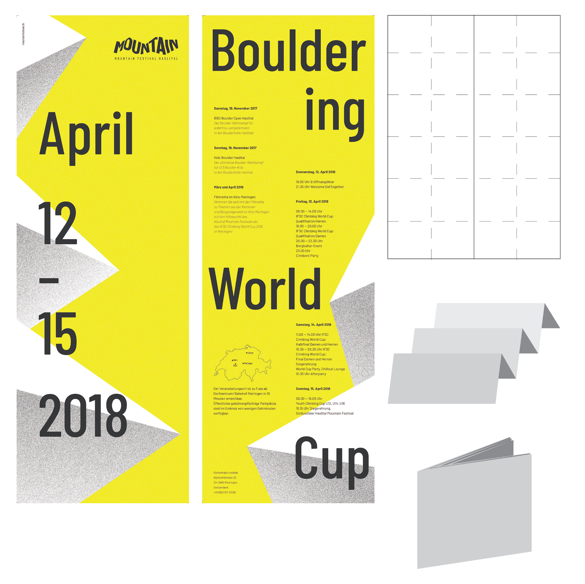
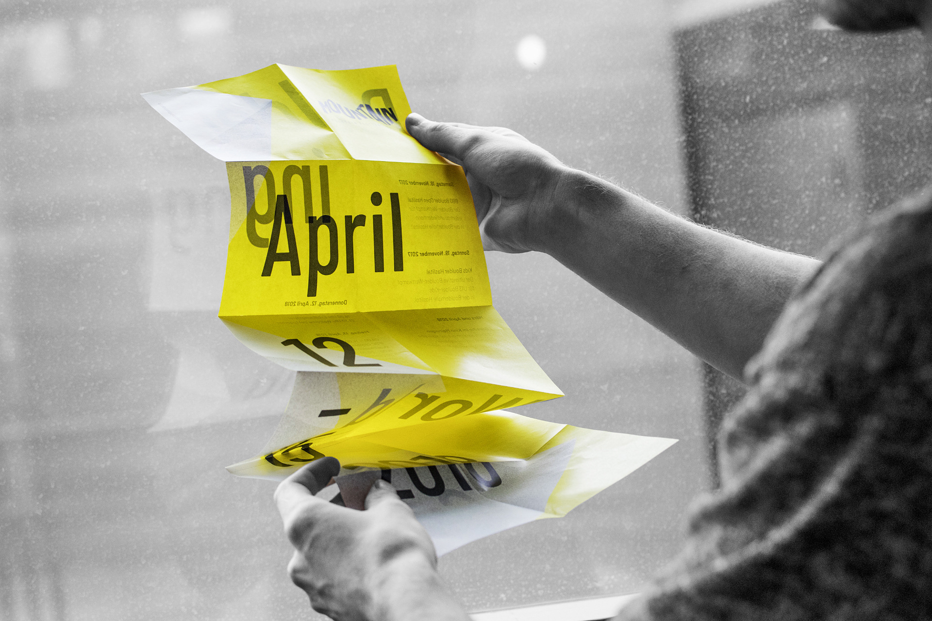
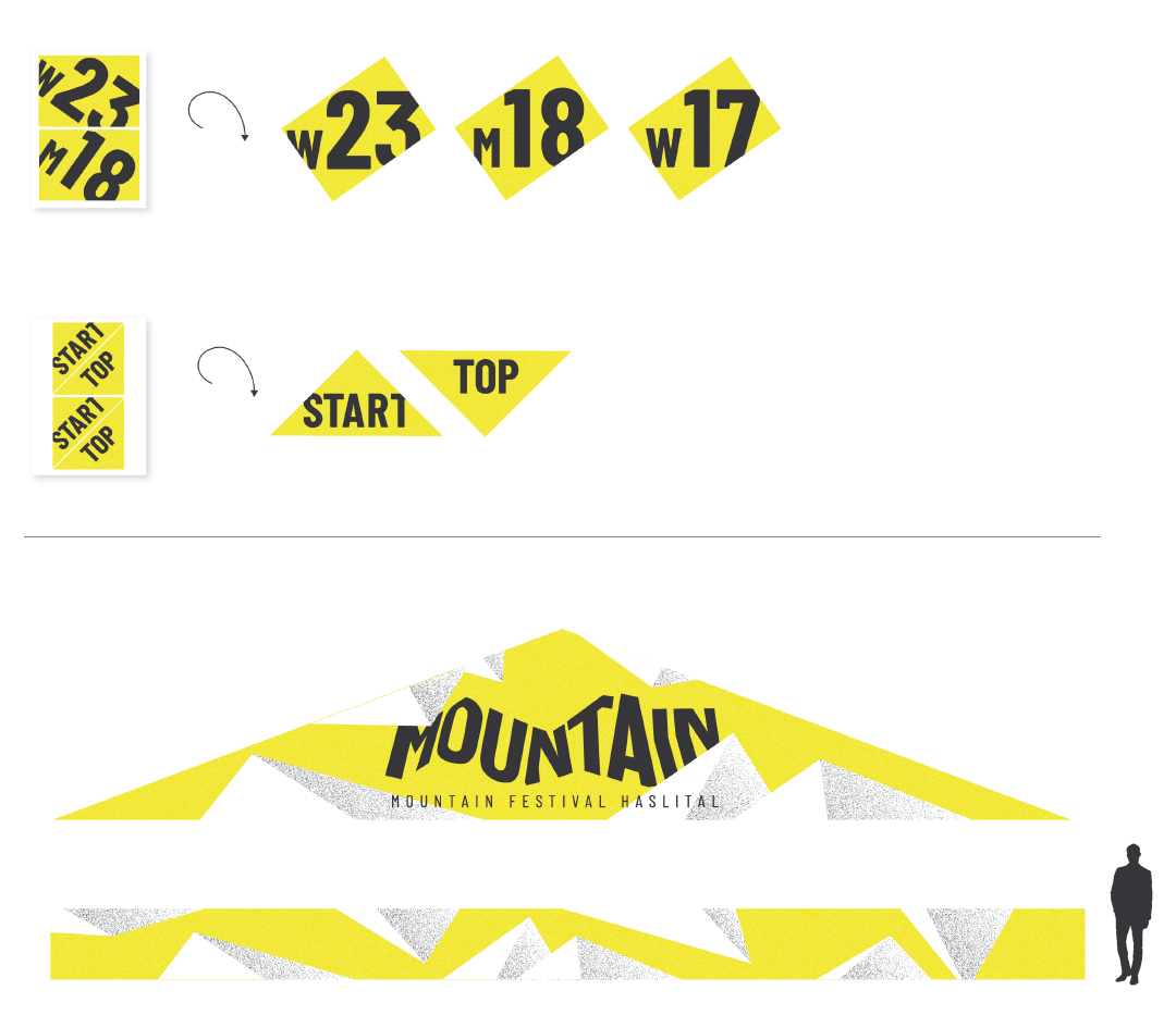
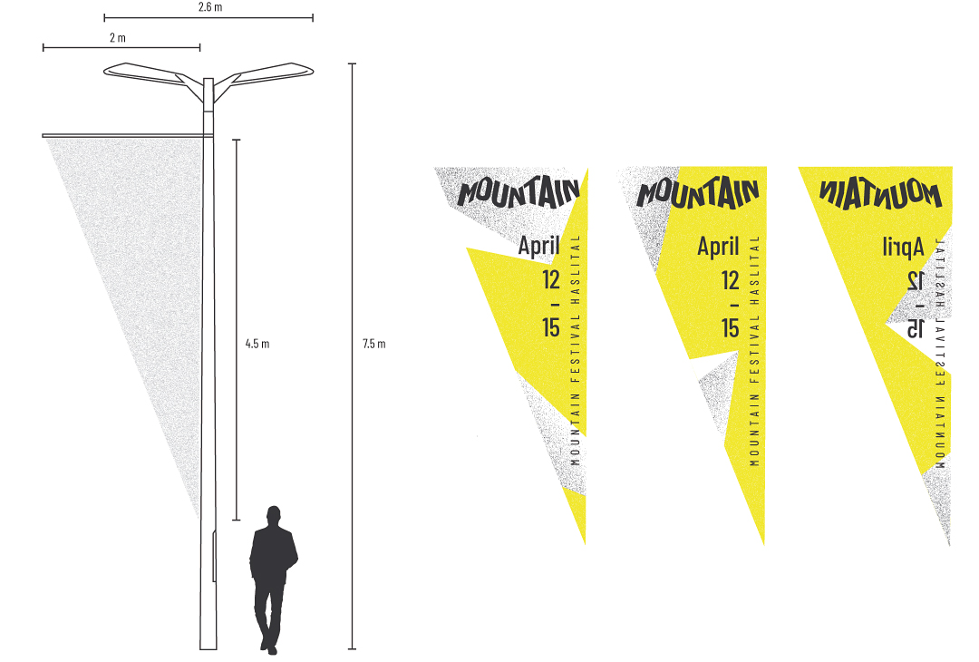
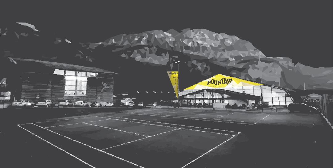
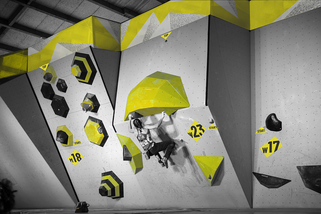
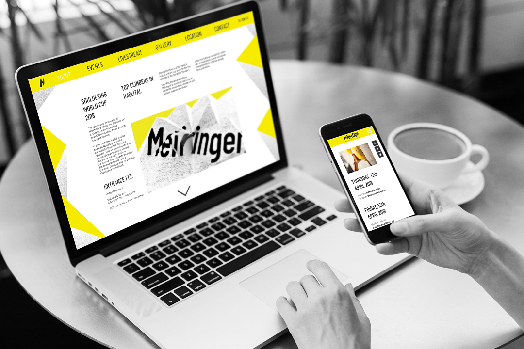
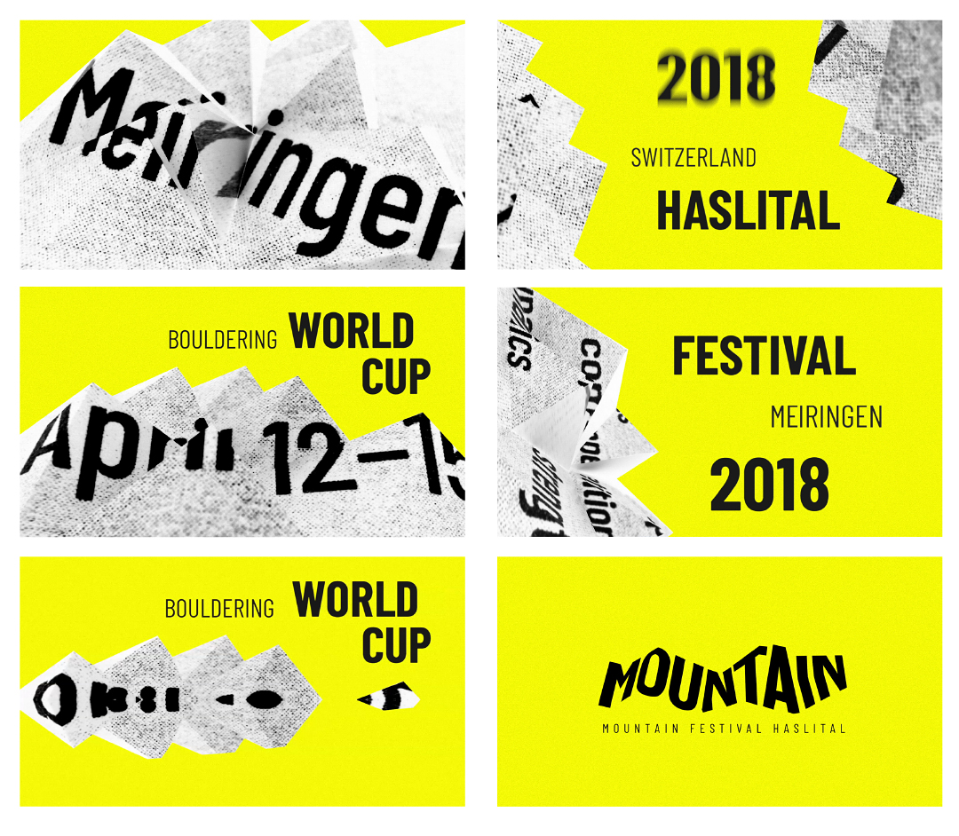
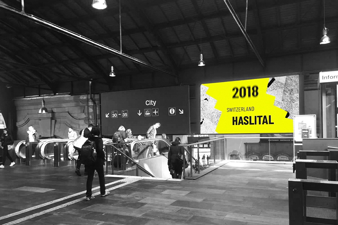
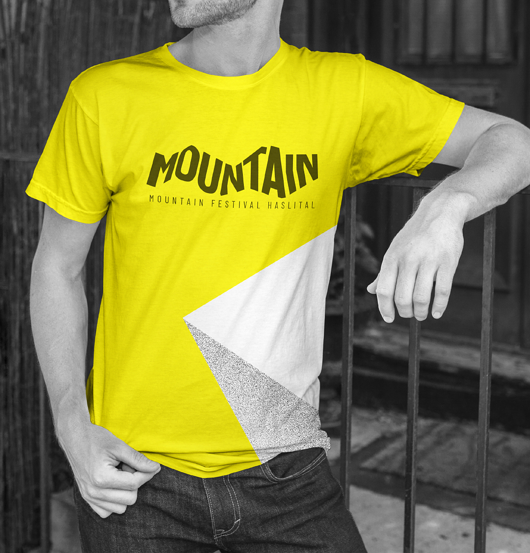
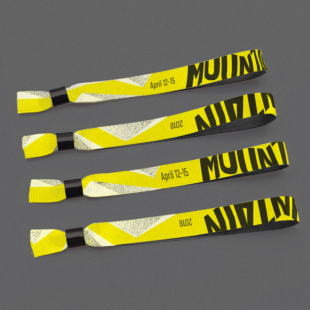
A fictional redesign for the annualy held Bouldering World Cup in Meiringen.
It started with the development of a logo and a key visual that are applicable to all different kinds of media.
2018
2018
Infographic

Web & Video
Merchandise
MahN

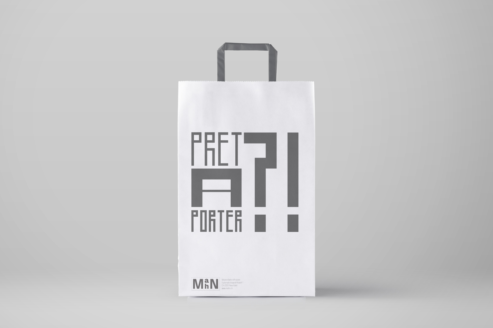
During Winter 2016/2017 the
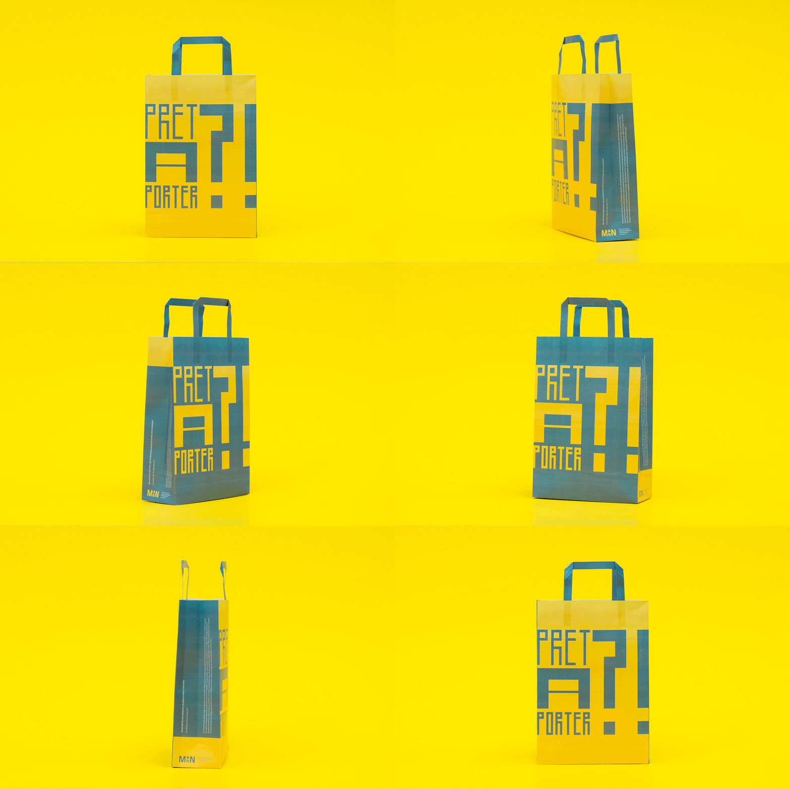
Musée d'art et d'histoire à Neuchâtel (MahN) exhibited swiss plastic- and paper-bags from the last 150 years. As part of a competition we were asked to design the bag for this exhibit. The content was given by the curators. Two versions were developed. One is very simple and reserved colour-wise. It stands for the history of paper-bags and their various designs. The other one is loud and flashy with fresh, almost toxic colours for the plastic-bags that came up in the fifties and offered new opportunities for designs with brilliant and shiny colour-prints.
Musée d'art et d'histoire à Neuchâtel (MahN) exhibited swiss plastic- and paper-bags from the last 150 years. As part of a competition we were asked to design the bag for this exhibit. The content was given by the curators. Two versions were developed. One is very simple and reserved colour-wise. It stands for the history of paper-bags and their various designs. The other one is loud and flashy with fresh, almost toxic colours for the plastic-bags that came up in the fifties and offered new opportunities for designs with brilliant and shiny colour-prints.
Schwabe


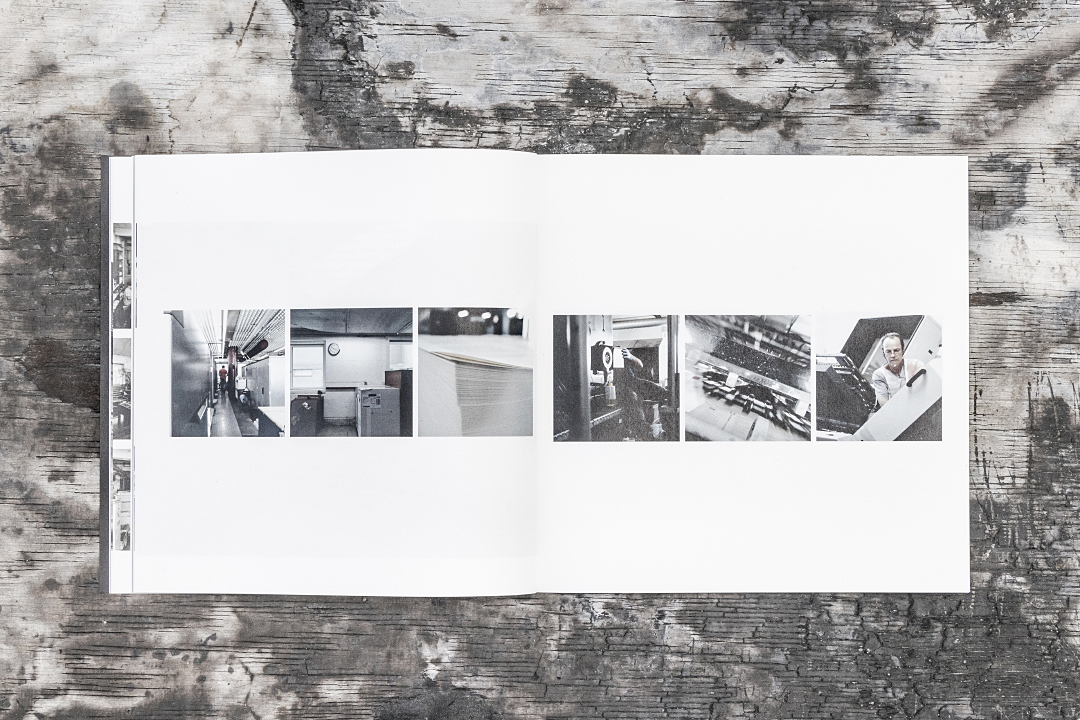
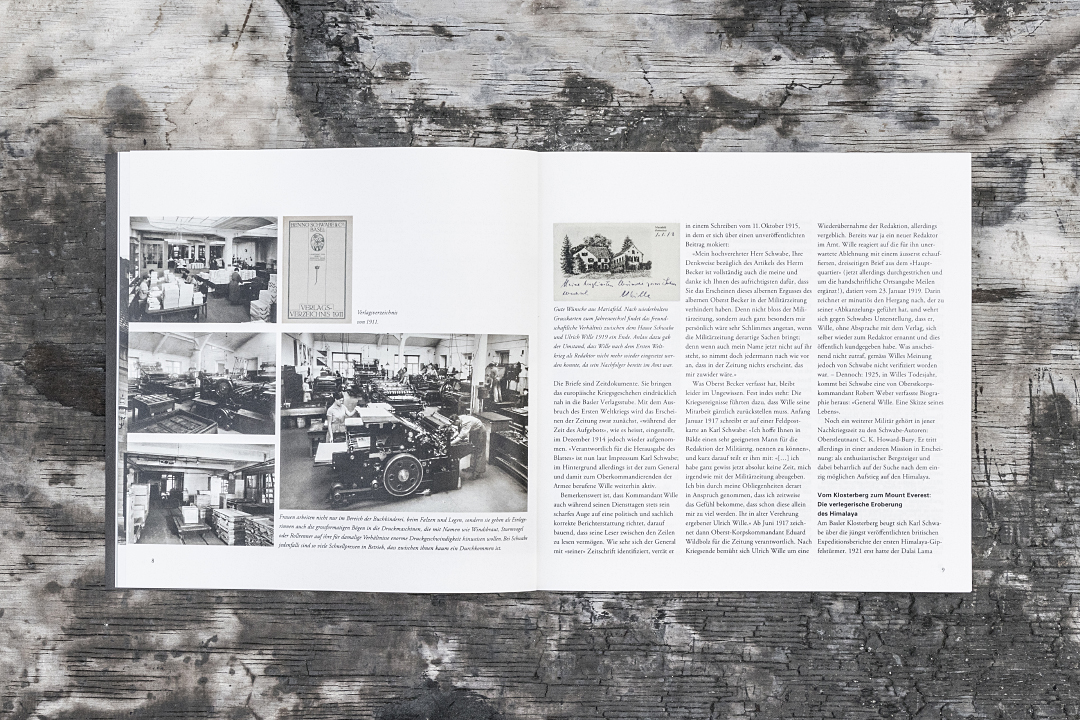


The worlds oldest and still existing publisher “Schwabe” is situated in Basel. Its long history of printing and publishing books has its roots in the 14nth century. This project was launched on the occasion of the 525th Schwabe-anniversary. The task was the creation of a special edition on Schwabes history through those centuries.
The aim was to include the modern appearance of todays company, but also showing the long history and quality since its foundation.
The books squarish format represents the window of the present time. Once opened, the format becomes a long rectangle that refers to the chronicle of the last 525 years up to now.